Globe Bank International — Customer Retention Analysis
Globe Bank International — Customer Retention Analysis Python Portfolio Project | End-to-End Customer Churn Analysis
Power BI Portfolio Project | Data-Driven Talent Development Insights
Training and development teams in organisations face a critical problem: they lack centralised, real-time visibility into training effectiveness and resource utilisation.
Imagine being an L&D manager responsible for hundreds of training sessions, multiple facilitators, and dozens of development projects—but all your data lives in disconnected spreadsheets. You spend 10-15 hours every month manually copying, pasting, and aggregating data just to answer basic questions:
This was the business problem I set out to solve.
I built a comprehensive 3-page Power BI dashboard that transforms raw training data into executive-ready analytics. The solution provides role-specific insights for three key stakeholder groups, enabling data-driven decision-making without manual reporting overhead.
The solution is structured as a 3-page analytical framework, with each page serving distinct stakeholder needs:
Strategic KPIs and high-level trends for senior leadership
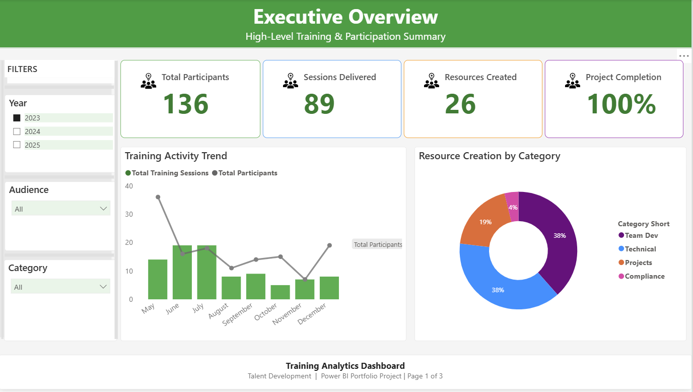 High-level KPIs and training activity trends for senior leadership decision-making
Key Metrics:
Key Visualizations:
Business Value: Executives can assess training impact in under 30 seconds without drowning in spreadsheet details. The dashboard immediately answers “Are we reaching our people?” and “Are we completing what we start?”
Operational insights for training managers and coordinators
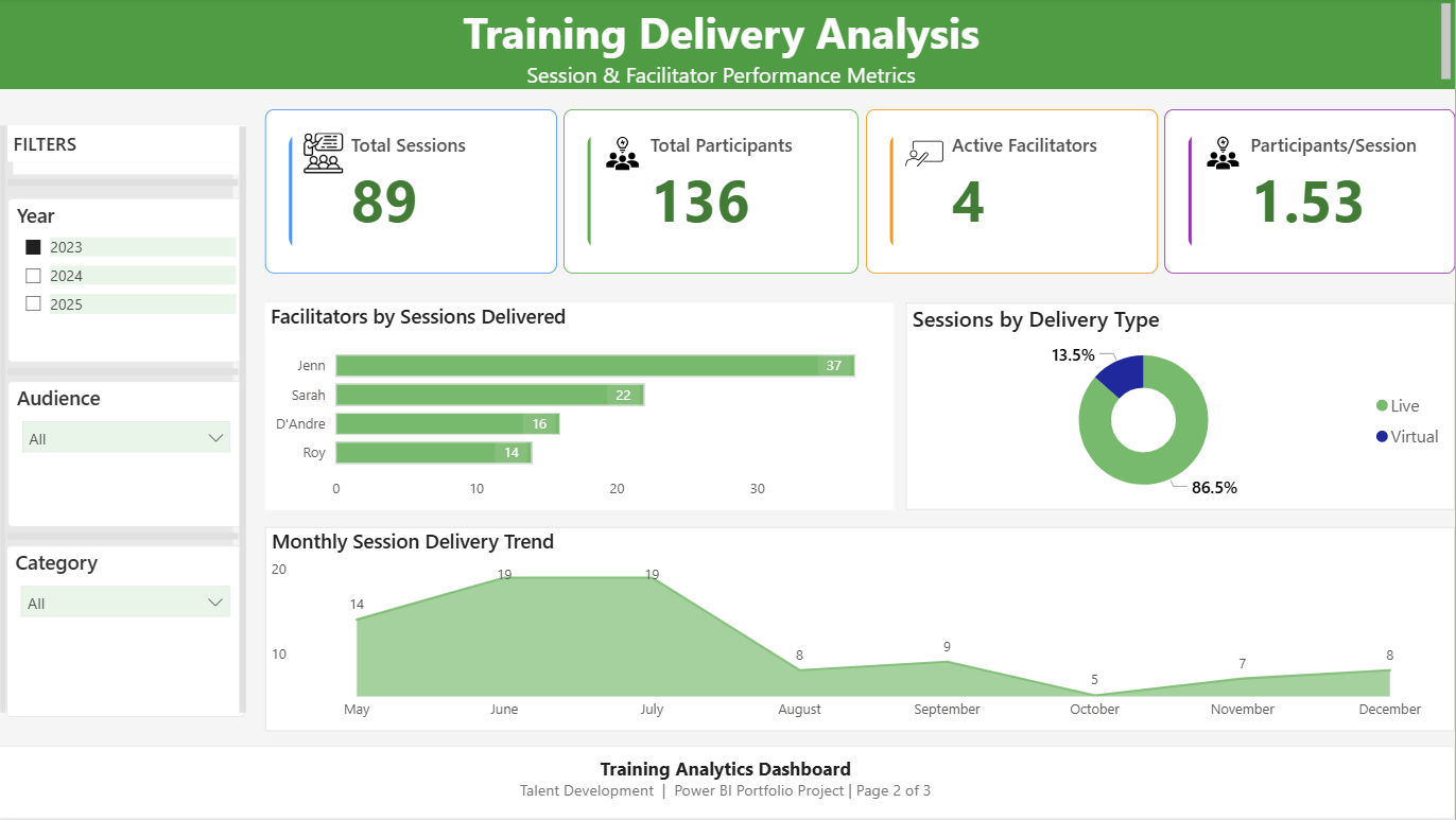 Facilitator performance metrics and session delivery insights for operational managers
Key Metrics:
Key Visualisations:
Business Value: Managers can identify workload imbalances (Jenn carrying 41% of delivery burden), understand delivery mode preferences, and anticipate seasonal capacity needs for proactive resource planning.
Project tracking and content creation insights for development teams
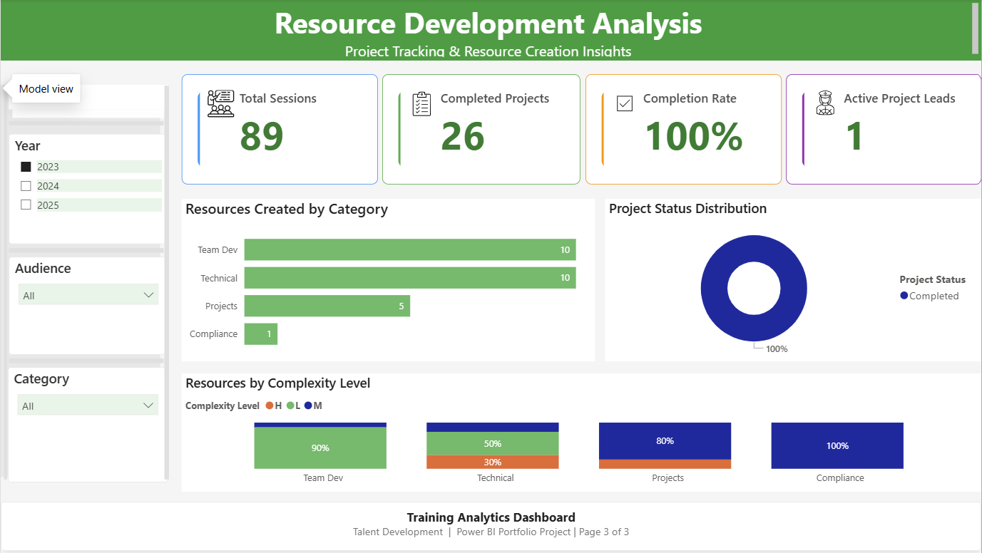 Project tracking and resource creation metrics for content development teams
Key Metrics:
Key Visualisations:
Business Value: Project leads can identify stalled initiatives, assess content complexity patterns, and align resource allocation with strategic priorities. The complexity breakdown helps with capacity planning—low complexity projects require less time investment.
I designed a star schema optimised for analytical performance and maintainability:
Fact Tables:
Facts_Training_Session – Training delivery data (89 sessions, participant counts, delivery types)Facts_Development_Projects – Resource creation tracking (59 projects, status, complexity levels)Dimension Tables:
Dim_People – Facilitators and project leads (shared dimension with Role column)Dim_Category – 6 training categories (Team Development, Technical, Projects, Compliance, Leadership, Onboarding)Dim_Audience – 7 target audience groupsDim_Date – Calendar table marked as date table for time intelligence functionsRelationship Structure:
Why Star Schema?
Power Query Steps:
Facts_Training_Session[Date] column stored as Text in source CSVDim_Category and Dim_Audience tablesAll measures are stored in a dedicated _Measures table for maintainability. Here are the key calculations:
// Basic aggregation measure
Total Participants = SUM(Facts_Training_Session[Participants])

// Row count measure
Total Sessions = COUNTROWS(Facts_Training_Session)

// Efficiency metric with error handling
Avg Participants per Session =
DIVIDE(
    [Total Participants],
    [Total Sessions],
    0
)
// The third parameter (0) prevents divide-by-zero errors when filters produce empty tables

// Distinct count for capacity tracking
Active Facilitators = DISTINCTCOUNT(Facts_Training_Session[Facilitator])
// Row count measure
Total Resources = COUNTROWS(Facts_Development_Projects)

// Filtered count using CALCULATE
Projects Completed =
CALCULATE(
    COUNTROWS(Facts_Development_Projects),
    Facts_Development_Projects[Status] = "Completed"
)

// Percentage calculation with proper denominator
Completion Rate =
DIVIDE(
    [Projects Completed],
    COUNTROWS(Facts_Development_Projects),
    0
)
// Formatted as Percentage with 0 decimal places in measure formatting

// Distinct count for team capacity
Active Project Leads = DISTINCTCOUNT(Facts_Development_Projects[Project Lead])

// Helper measure for chart aggregations
Project Count = COUNTROWS(Facts_Development_Projects)
The Problem:
During development, I encountered a calculation error that produced inflated completion percentages:
Original Formula (Incorrect):
Completion Rate = DIVIDE([Projects Completed], [Total Resources], 0)
Issue: This formula divided completed projects by total resources—two conceptually different metrics. When filtered, this produced nonsensical results like 145% completion.
Root Cause Analysis:
[Projects Completed] counted projects with Status = “Completed”[Total Resources] counted all rows in the development projects tableCorrected Formula:
Completion Rate =
DIVIDE(
    [Projects Completed],
    COUNTROWS(Facts_Development_Projects),
    0
)
Why This Works:
COUNTROWS() on the same tableResult: Accurate 100% completion rate (26 completed ÷ 26 total) that reflects true portfolio health.
Lesson Learned: Always ensure that percentage calculations use compatible numerators and denominators that respond to filter context in the same way.
Colour Palette:
I selected colours with semantic meaning to guide user interpretation:
#2E7D32 (Dark Green) – Headers, branding elements#4CAF50 (Green) – Positive outcomes, completed status#2196F3 (Blue) – General KPIs without positive/negative connotation#FF9800 (Orange) – In-progress status, medium complexity#9C27B0 (Purple) – Derived calculations like averages and percentagesStatus & Complexity Colours:
#4CAF50 (Green)#FF9800 (Orange)#E0E0E0 (Light Grey)#4CAF50 (Green)#FF9800 (Orange)#E53935 (Red)Technical Specifications:
#F9F9F9 background for reduced eye strain1. Progressive Disclosure
2. Consistent Navigation Pattern
3. Semantic Colour Coding
4. Accessible Contrast
Symptom: Power BI prevented direct relationship creation between fact tables and shared Category/Audience columns, displaying error: “This relationship has a many-to-many cardinality and can’t be used.”
Root Cause: Both Facts_Training_Session and Facts_Development_Projects contained Category and Audience columns. Power BI detected that a single category value appeared in multiple rows of both tables, creating a many-to-many relationship pattern.
Solution:
Dim_Category with unique category valuesDim_Audience with unique audience valuesFacts_Training_Session[Category] → Dim_Category[Category]Facts_Development_Projects[Category] → Dim_Category[Category]Result: Clean star schema with proper relationships. Filters now cascade correctly from dimensions to both fact tables.
Learning: Always create dedicated dimension tables for shared attributes rather than reusing columns across fact tables. This is fundamental to star schema design.
Symptom: Completion Rate KPI displayed nonsensical values (e.g., 145%, or changing erratically with filters)
Root Cause: Original formula DIVIDE([Projects Completed], [Total Resources], 0) divided two conceptually different measures that responded differently to filter context.
Solution: Changed denominator to use COUNTROWS(Facts_Development_Projects) to ensure both numerator and denominator use the same table context.
Result: Accurate 100% completion rate that correctly reflects 26 completed projects out of 26 total.
Learning: Percentage calculations require compatible numerators and denominators. Both should reference the same table or respond identically to filters.
Symptom:
Root Cause: Source CSV stored dates as text strings (e.g., “2023-05-15” as Text data type)
Solution:
Facts_Training_Session[Date] columnResult:
Learning: Always verify data types during initial data import. Text-formatted dates are a common issue in CSV files.
Symptom: “Top Project Leads” bar chart displayed the same value for all facilitators, despite different actual contribution levels.
Root Cause: Chart used the [Total Resources] measure instead of counting individual records per person. The measure returned the same grand total for each facilitator.
Solution: Changed the chart’s Values field from [Total Resources] to Count of Project ID, which correctly counts distinct projects per person.
Result: Accurate representation showing differential contributions (e.g., Lead A: 15 projects, Lead B: 8 projects).
Learning: When creating “per person” or “per category” charts, use row-level counts or sums rather than aggregate measures that might not respect the visual’s grouping context.
If deployed in a real organization, this dashboard would deliver:
Efficiency Gains:
Strategic Benefits:
Resource Optimisation:
For Executives:
For Training Managers:
For Project Leads:
Power BI Platform:
Data Modelling:
DAX (Data Analysis Expressions):
Power Query (Data Transformation):
Business Analysis:
Problem-Solving:
Communication:
Visual Design:
Accessibility:
User Experience:
Predictive Analytics:
Drill-Through Capabilities:
Advanced DAX:
Automated Alerts:
Benchmarking:
GitHub Repository: View Full Documentation & Code
Project Files:
Training_Analytics_Dashboard_Portfolio.pbix – Power BI report file (interactive workbook)data/Training_Delivery_Sessions.csv – Training session data (89 sessions, 2023)data/Training_Development_Projects.csv – Resource development tracking (59 projects)documentation/ – DAX measures, data model diagram, technical specificationsDownload Dashboard: Training_Analytics_Dashboard_Portfolio.pbix
Technical Lessons:
Data modelling is foundational – A clean star schema prevents countless downstream issues. Investing time upfront in proper dimension tables saved hours of troubleshooting later.
DAX requires careful validation – My completion rate error taught me to always test measures with multiple filter combinations. A formula that works with no filters might break when users apply slicers.
Data types matter – The date column issue (text vs. date) showed me that seemingly small data preparation steps have cascading impacts on visualization capabilities.
Design Lessons:
User experience trumps technical complexity – I could have added 20 more charts, but the three-page structure serves stakeholders better by reducing cognitive overload.
Semantic colour coding reduces mental load – Using green consistently for “success” and orange for “progress” means users decode meaning instantly without reading legends.
Process Lessons:
Documentation is essential – Detailed specifications enabled me to hand off this project confidently. In a real job, colleagues could maintain this dashboard without asking me constant questions.
Iterative development is realistic – I encountered 9 technical issues during development (documented in the handover report). Each issue taught me something new, and troubleshooting is where real learning happens.
As a recent Master of Data Science graduate, this project demonstrates my readiness for Data Analyst roles by showcasing:
End-to-End Capability:
Business Acumen:
Independent Problem-Solving:
Stakeholder Awareness:
Communication Skills:
Real-World Readiness:
I’m actively seeking Data Analyst opportunities where I can apply Power BI, DAX, and business intelligence skills to drive data-informed decision-making.
Portfolio: https://moshraf.github.io/
LinkedIn: https://www.linkedin.com/in/moshrafhossain/
Email: mmoshraf@gmail.com
GitHub: https://github.com/moshraf
Interested in discussing this project or exploring collaboration opportunities? I’d love to connect!
Built with: Power BI Desktop | DAX | Star Schema Modelling | Power Query
Project Duration: 4 weeks (January - February 2026)
Status: Complete & Portfolio-Ready ✅
Tags: #PowerBI #DataAnalytics #DAX #BusinessIntelligence #DataModelling #PortfolioProject #DataScience
Globe Bank International — Customer Retention Analysis Python Portfolio Project | End-to-End Customer Churn Analysis
Training Analytics Dashboard Power BI Portfolio Project | Data-Driven Talent Development Insights
Introduction This SQL project involves analyzing the sales and customer data of H+ Sport, a fictitious company that sells nutritional products and active lif...
Introduction The project is to demonstrate the use of SQL to extract meaningful insights from a hospital database. This includes analysing patient demographi...
Your brain has two systems, a slow analytical side and a quick, instinctive “gut” side. For the most part, the instinctual side is lazy, conserving its energ...
“Color does not add a pleasant quality to design—it reinforces it.” — Pierre Bonnard
Tips for Designing a Color Palette In the first two sections of this book, Color Limitations and Color and Emotions, we looked at some interesting facts abou...
Color and Emotions Mention Thanksgiving to any American and they will paint a picture in their head with gold, orange, red, and brown hues. It will also like...